Balancing The Pastel Trend
The bold hues that brightened our homes a few years back, and the quiet neutrals that have been ruling the palette more recently, have found a way to work together. Pastel shades are poised to serve as a defining colour trend – pairing the simple beauty of primary colours with the softening touches of white and cream, these light, fresh hues find a subtle way to exude energy and positivity.

A journey towards balance
No colour trend comes without a story, and pastels are no exception. In their case, the story is about finding balance and harmony. On several occasions in the past, rich, bold hues have come knocking on our doors with the promise of plush sophistication. Their most recent visit dates back to about five years ago, when vivid shades of teal, tangerine, emerald and flamingo pink flooded homes, wardrobes, and all forms of visual media. In the years that followed, we watched these colours retreat into occasional pops and highlights, making way for the neutral tones that now characterise our living spaces.
Designers then explored ways to add zest to these neutral or earth-toned spaces, primarily through subtle undertones of warm or cool colours. The popularity of dusky pink and pastel blue in contemporary homes is a characterising example. So is the selection of “living coral” as Pantone’s colour of the year for 2019. Vivid in their origins yet muted in their appearance, these hues and shades have a subtle charisma that fits right in with sophisticated sensibilities. These sensibilities will find their most evolved expression yet in the pastel palette of today, which may even replace neutrals as a home décor default.
Bringing the pastel trend home
Besides being easy on the eyes, pastel shades are also easy to implement in home decoration. In fact, this is hardly their first appearance on the interior design scene. Pastel greens and blues, mixed with muted yellows and jewel tones, are rooted in our memories of home interiors from the ‘60s. Today, they continue to feature in retro-themed furnishings, accessories and kitchenware. The pastels of toady are loosely based on the same ideas, though their expression is lighter, fresher, and decidedly happier than their retro counterparts.
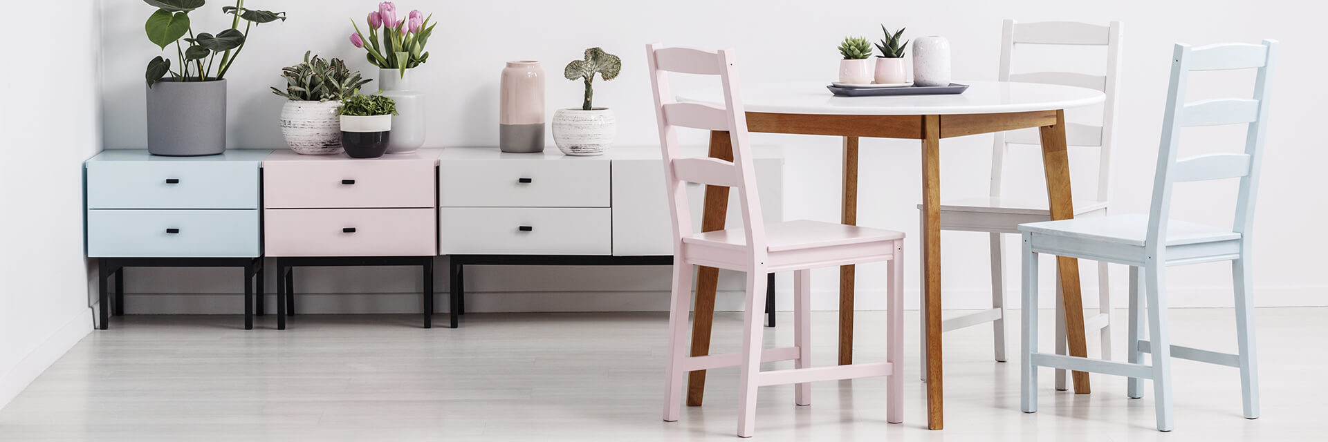
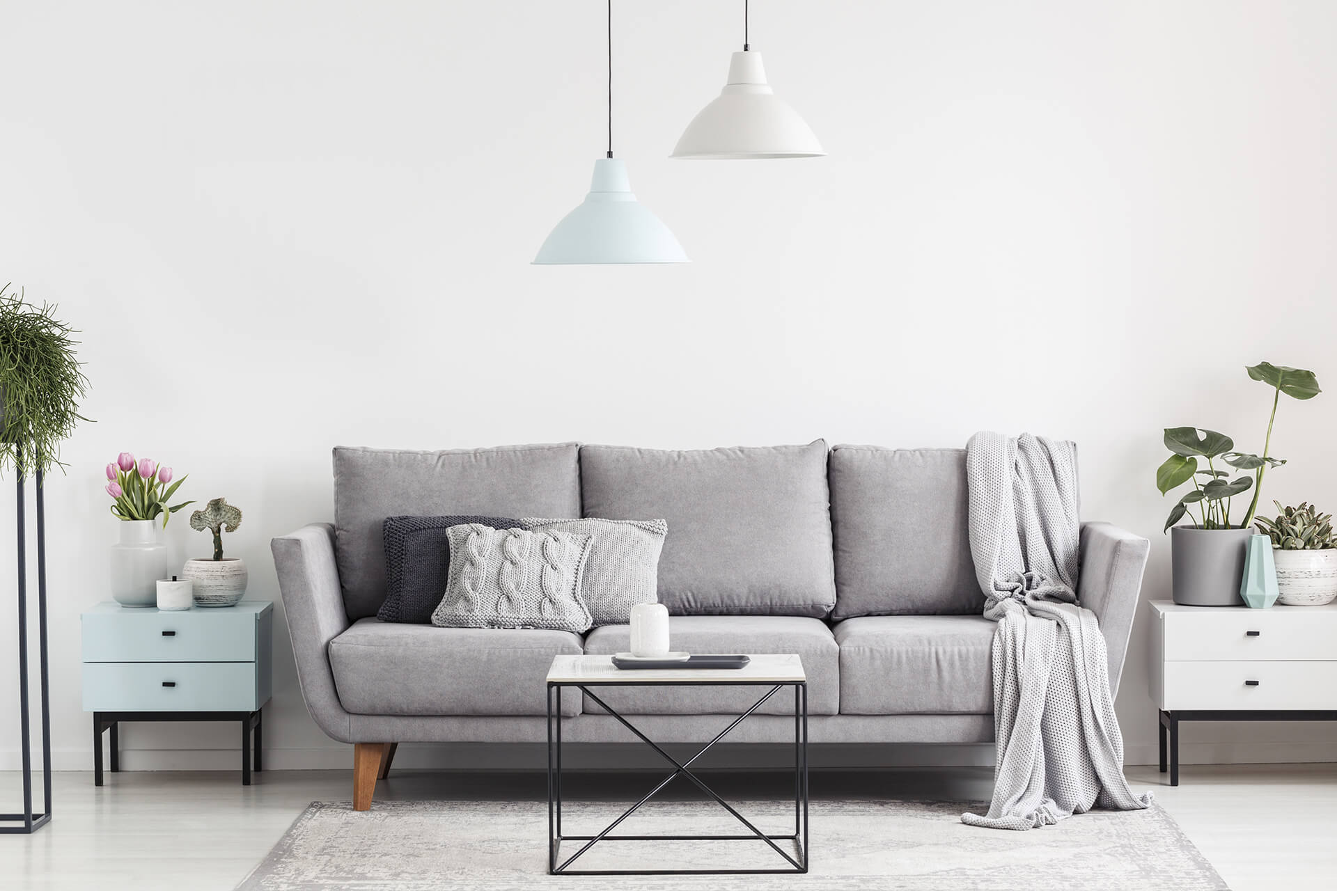
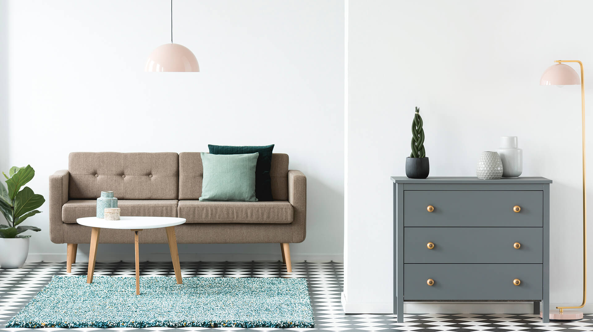
The key to achieving a well-balanced mix of pastels in your living space lies in adding these colours to your image of a neutral palette. As extensions of white, beige and grey, these muted shades can bring delicate hints of warmth, energy or serenity into an otherwise neutral room. The use of grey in soft furnishings, cushions and rugs, for example, can easily be replaced with a pastel variant of blue or turquoise, shifting the ambiance towards calm without overriding the stabilising effect of white or beige surroundings.
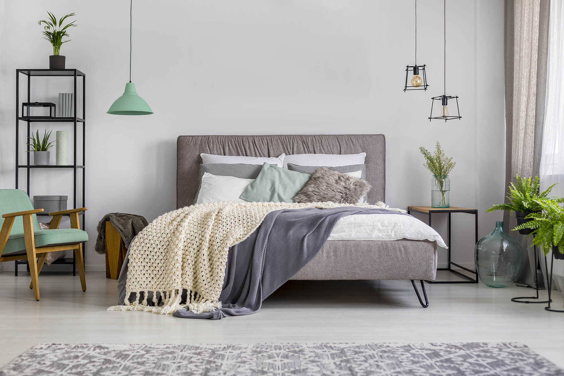
Likewise, muted pinks can add subtle doses of playfulness to white or grey themed surroundings, in the shape of accessories, lighting fixtures, or tactile elements. The new pastel palette will also see a lot of muted greens such as celery and avocado, and delicate orange tones such as peach and coral. Softened by a milky-white or cream overlay, these delicious colours can comfortably fill large swathes of wall or flooring without overwhelming the senses. Their cheerful bearing welcomes the use of natural elements such as houseplants and wooden finishes, which can layer the final composition with fresh, welcoming vibes.

The pastel trend is unique in its subtlety, adaptability, and openness to design explorations. Bring it home in its variegated yet harmonious splendour, and craft a new brand of approachable elegance in your living space.